

Tyndale 1534 New Testament Facsimile, Linen Hardcover
Regular price $55.00
Tech Specs
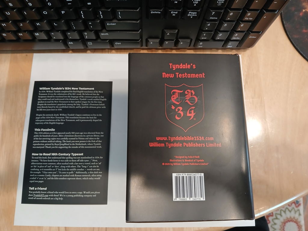
External book dimensions: 6 3/4" x 4 1/2" x 2 1/4"
Weight: 31 ounces
Scanned in Vienna, Printed in the Netherlands

This is William Tyndale’s 1534 New Testament as it first appeared nearly 500 years ago. One of the last surviving copies was carefully scanned in Vienna and taken to the printers without artificial editing. This facsimile was printed by Royal JongBloed in the Netherlands, the country where Tyndale was martyred in 1536. It gives you a “warts-and-all” look at how the English Scriptures originally appeared in the Protestant Reformation.
Foundational to Modern English

This book became the basis for subsequent translations of the New Testament, and it permanently shaped the trajectory of the English language. This facsimile reproduces Tyndale’s lasting work in a way the public hasn’t seen for many hundreds of years. Each purchase comes with a little card that assists in reading 16th Century typeset.
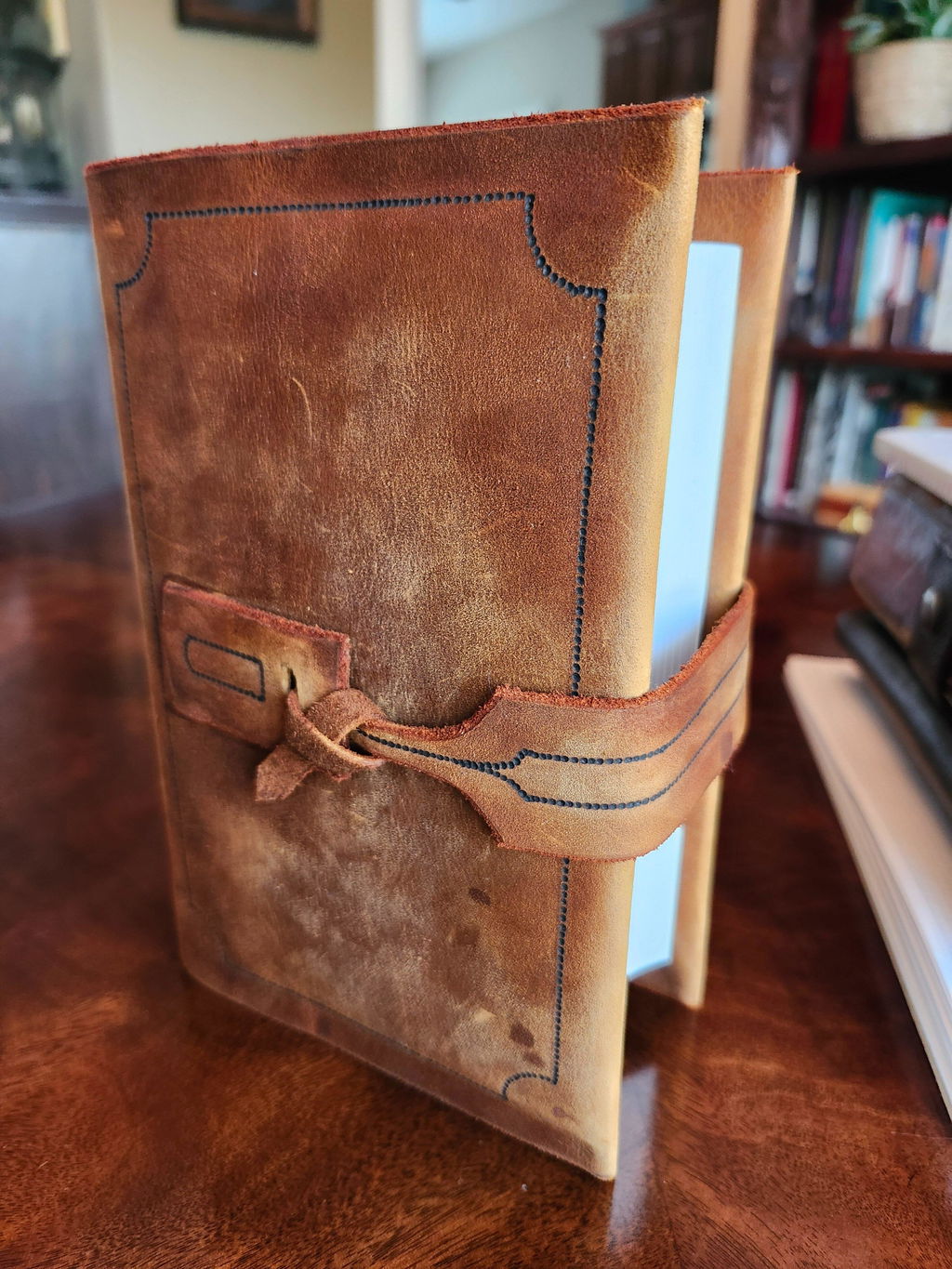
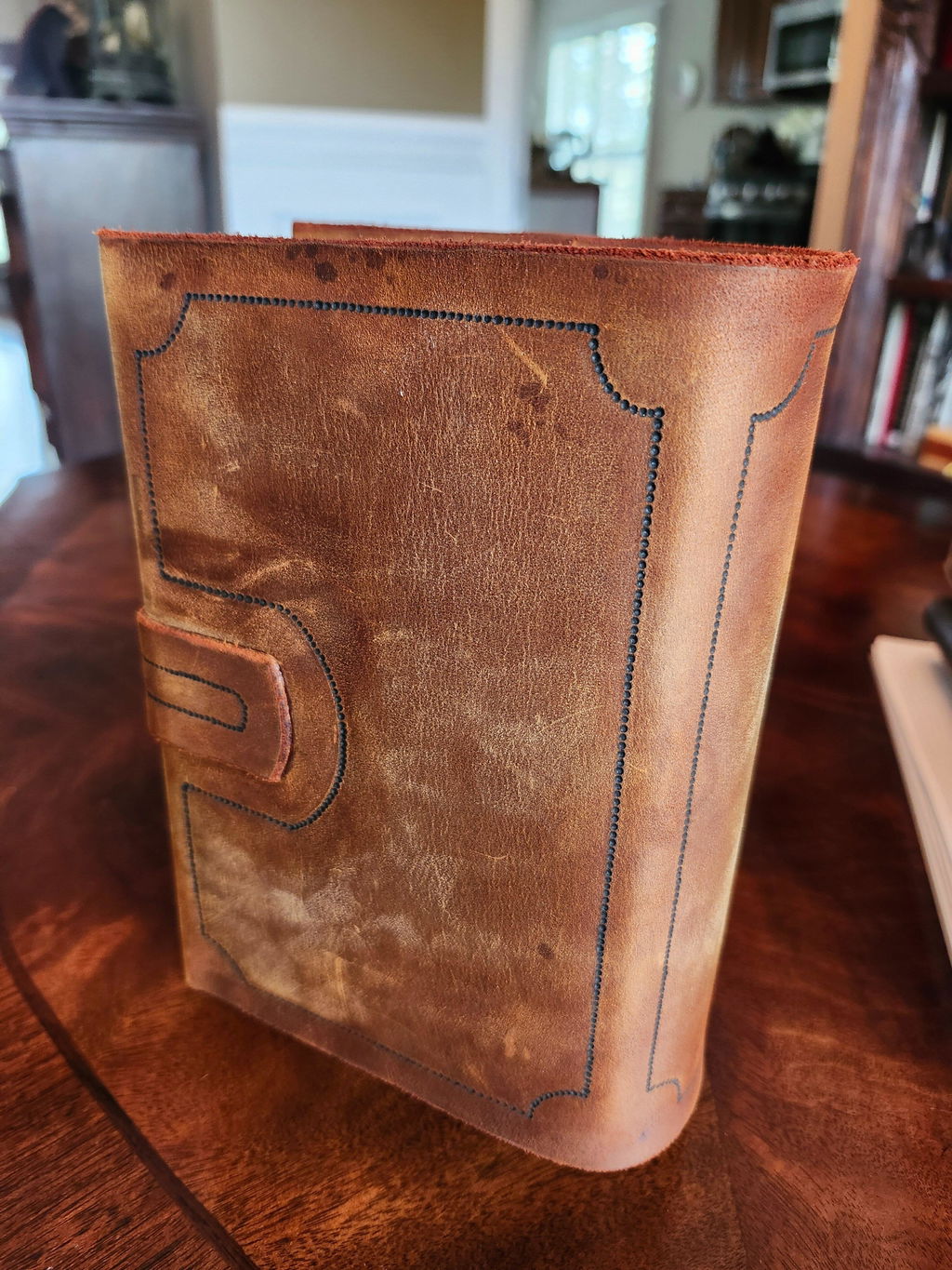
The book itself is made with outstanding quality. The fact that we can hold in our hands today a sturdy facsimile copy of William Tyndale's New Testament 492 years later is amazing. As stated in the listing, the 1534 font and wording is more difficult to read that later printings like the 1560 Geneva Bible and the 1611 King James Bible. But like those Bibles, as you read and get more familiar with the text it becomes easier after time. The print itself is great quality. Yes some pages are a little lighter than others, but that's because this is an accurate copy of a book that is almost 500 years old. I actually like the fact that the print of the pages hasn't been altered. Each page contains the entire original page with about 1/4" - 3/8" of white border beyond the original edges. It's well worth the cost in my opinion to be able to hold a strong well made copy of this historic book. I made a distressed leather cover for my copy.
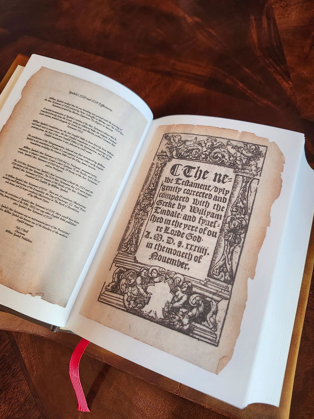
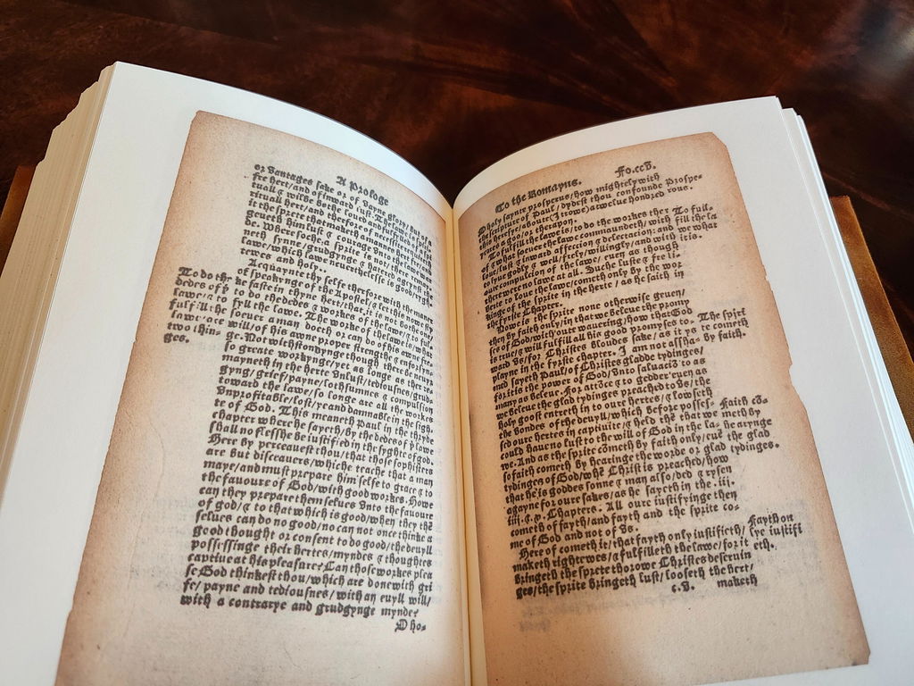
My absolute favorite types of Bibles are old English Bibles from 1526-1611. I have many early English facsimile Bibles from those years such as: 1526 Tyndale New Testament, 1537 Matthews Bible, 1539 Taverner Bible, 1560 Geneva Bible & 1611 King James Bible but this 1534 Tyndale New Testament is by far the most challenging to read out of all the Bibles I own.
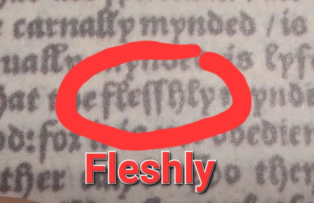
All these Bibles I mentioned the font is printed where the letter "S" looks like an incomplete F (no crossbar), so I was used to that at the time of receiving my 1534 Tyndale. But what I was not used to was the letter "L" looked nearly identical to the S & F. The only difference is if the top curls around an touches the upright line it's an L. Again, none of my other Bibles have the letter L like this and that is what I found most challenging reading through the 1534 Tyndale New Testament. But remember, if it doesn't challenge you, it wont change you.
Giving my honest review after having read through the whole Tyndale 1534 New Testament From Matthew to Revelation and I had a blast reading it & comparing it to the King James as I went through it. Enjoyed reading through the 1534 Tyndale so much that I immediately began to read my 1526 Tyndale from Matthew to Revelation right after completing the 1534 (got a few more books to go on the 1526).
Much thanks to Felix for opening his personal library and allowing copies to be made of his original 1534 Tyndale New Testament. I posted a video review on youtube and Felix left a bunch of comments on my video. Very cool.
I would highly recommend this 1534 Tyndale New Testament but only after you have been reading in the old english font for a while and being somewhat fluent in it, otherwise reading this 1534 Tyndale they would most likely want to give up out of frustration not being able to make out the words if this was the first time with olde English. Again the 1534 Tyndale is the most challenging early English Bible facsimile I own to actually read through so I would NOT recommend the 1534 Tyndale as your 1st old English facsimile.
p.s. the font for the prologues of the books is even MORE CHALLENGING to read as they seem to be a bit smaller. This Bible is only for those with good eyesight and patience.

This is a fitting tribute to the ministry and memory of William Tyndale. The careful craftsmanship is superb and it even exceeded my high expectations. I urge everyone to order this splendid volume.
[ Note: I was an original backer and had requested the leather bound version, but had to settle for the cloth binding instead. ]
My copy of the cloth bound version arrived today, and I must say that it looks great and is very well constructed! But oh how much nicer a leather version would have been to hold. I'm still miffed about that version being mothballed for now, but the cloth version is still quite nice. Great work and congratulations to all involved.
One comment about shipping: my copy arrive with no damage or banged corners but it easily could have gone otherwise. The ONLY way to ship premium books like this is to fully encase them in at least a single layer of bubble wrap, preferably two. A few pieces of crumpled brown wrapping paper on three sides of the box only (top, left, cover) still leaves many corners of the book at risk of damage if the box is treated roughly.
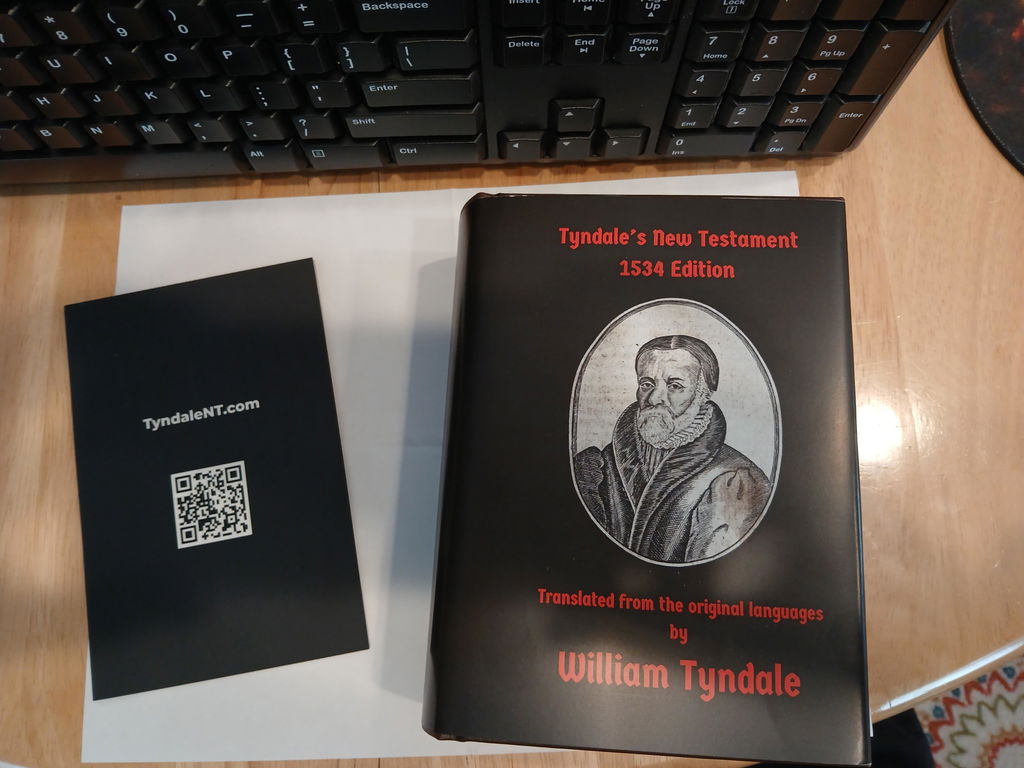
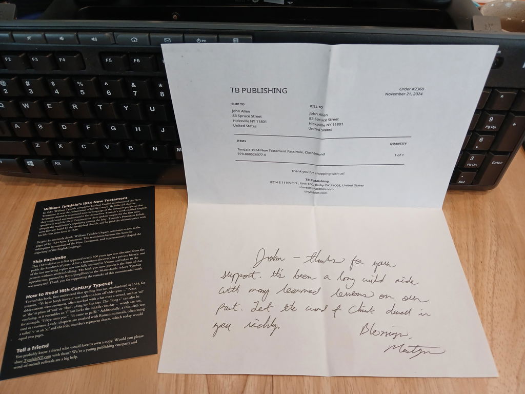
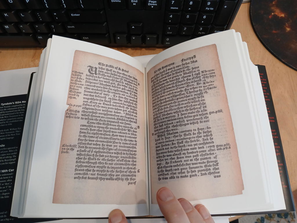
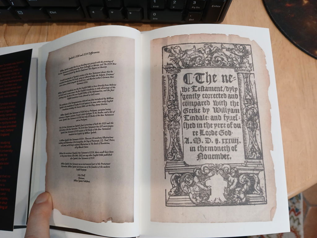
What a blessing to hold a piece of history in my hands. Tyndale sacrificed so much to get God's Holy Word in our hand so that we can read and understand it in our language. This facsimile is very well printed and constructed. The words can be slightly blurred ( Afterall, it is a copy of a nearly 500 year old document of great importance!), but it is very readable with a little practice and patience. I highly recommend that anyone that is interested in the history of the English Bible, have this in their library. Thank you for making this available!
All was good - order from Sweden
Hi, I use it every day. The only change I would suggest, is darkening the background of the words at tad. It seems the lightness of the background detracts a little from my reading process. It could just be my eyes, though. Otherwise, I’m so grateful for it.
Great Bible!
To be able to have a copy of Holy Scripture in English from 1534, in which, I can read the same trustworthy saying that deserves full acceptance written from the Apostle Paul to Timothy, that Christ Jesus came into the world to save sinners, is a rich and edifying piece of history that has been joyfully added alongside all my blessed modern translations of God's Word originating from the labor and sacrifice of Tyndale.
Although this is not a New Testament that I read often and even have trouble reading due to the older writing styles and English, I'm granted a wealth of encouragement remembering the faithful saints before us that had this very copy in their hands and my heart is strengthened all the more to spend my life abundantly as they did in the preservation and proclamation of the words of eternal life that abide in these pages.
This has already been a sweet conversation piece with individuals in my life and among my family, where praise unto the Lord has been wrought for His great faithfulness over the centuries.
May the Lord bless all who have worked on making this facsimile a reality. It is a treasure, bringing glory to God our Father and the Lord Jesus Christ.
This is a piece of history you can hold in your hands. Tyndale died to bring the word of God to the common man.
You could have in your hands the very volume that did so. From obscure language to the English.
I will grant you, it is old English, and in unfamiliar script. However, you can work your way through the script, if you try.
I am grateful for my copy for a couple reasons.
It is the word of God, which will not be quenched, and for Tyndale,who gave his life, to bring me the Word.
I backed leatherbound version on Kickstarter, disappointed I had to change but decided to get one more with the added discount, giving one away as a gift. They arrived in one piece and look to be in really nice quality. I saw this randomly, and being a history-nerd of sorts, I love the story behind this Bible, and can see the importance of preserving it.
Even if you're not particularly religious, like myself, I would recommend getting a copy. It is clear that care has been put into this project, and having a little piece of history on your bookshelf never hurt.